Album Advertisement Research
In this post I research magazine album advertisements ahead of creating my own.


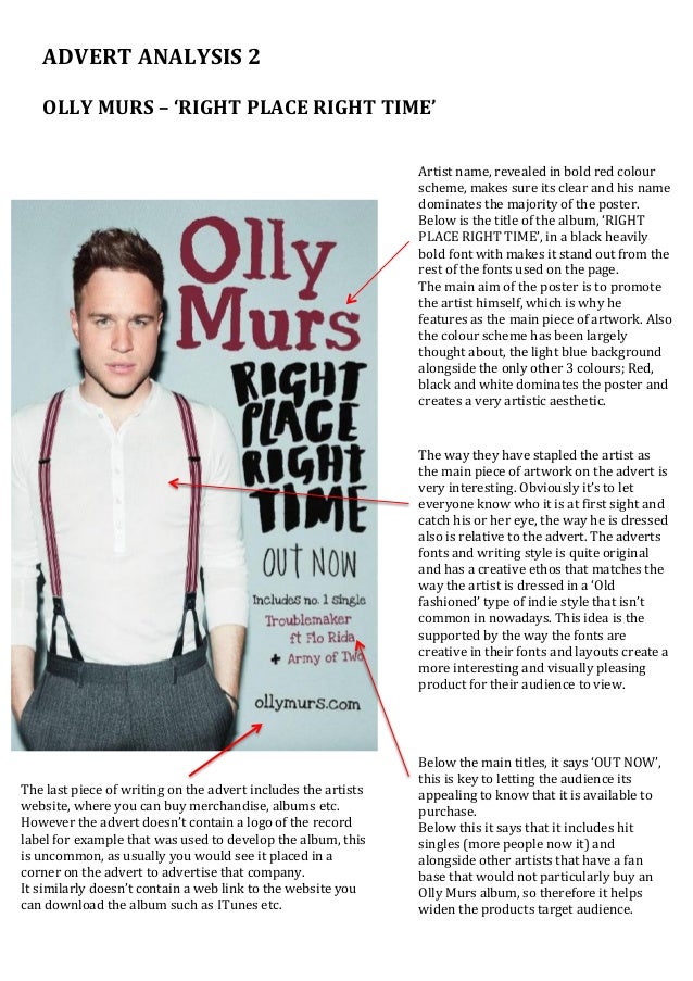
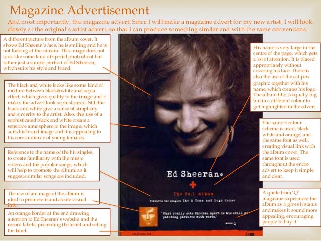
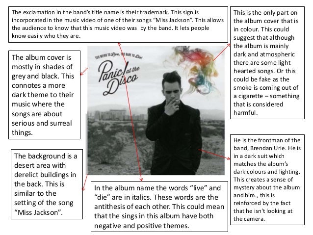
A common convention throughout all of these album advertisements is a close up/mid shot of the artist, or in the case of the Kasabian album cover, an illustrated close up. Alternatively, the advert for Eminem's album "Recovery," he is walking away from the shot, and is framed to the left. Consistently we see the artists name featured at the top of the page with the album name underneath. Often, we also see that hit singles are included on the album, and possibly websites or social media contacts may be included, typically at the bottom of the page. When it comes to creating my own magazine advert, I was inspired by the "Recovery" advert, and wanted to use a long shot rather than a close up. I was also inspired by the arrangment of the typography in Florence and the Machine, and the colour scheme of Lana Del Rey's "Born To Die". Below, I have found an analysis of some of these covers to help me better understand and identify key conventions of these covers.


A common convention throughout all of these album advertisements is a close up/mid shot of the artist, or in the case of the Kasabian album cover, an illustrated close up. Alternatively, the advert for Eminem's album "Recovery," he is walking away from the shot, and is framed to the left. Consistently we see the artists name featured at the top of the page with the album name underneath. Often, we also see that hit singles are included on the album, and possibly websites or social media contacts may be included, typically at the bottom of the page. When it comes to creating my own magazine advert, I was inspired by the "Recovery" advert, and wanted to use a long shot rather than a close up. I was also inspired by the arrangment of the typography in Florence and the Machine, and the colour scheme of Lana Del Rey's "Born To Die". Below, I have found an analysis of some of these covers to help me better understand and identify key conventions of these covers.


Comments
Post a Comment